Project Recap: Adobe Systems / San Jose, CA
Quick side note: I have memories of using Adobe Photoshop since the early days of getting my feet wet as an artist/designer making everything from club flyers to church pamphlets to pay for art supplies, so to reciprocate some creative love for their original headquarters 22 years later was a truly an honor.
Growing up in the Bay Area with access and early influence from both nature and technology, the idea was to tie in my connection to the area while striking a balance between free form layering and methodical compositions — a common practice in all the work I do.
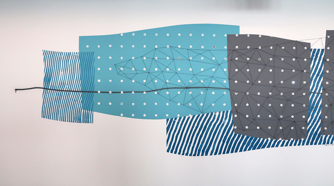
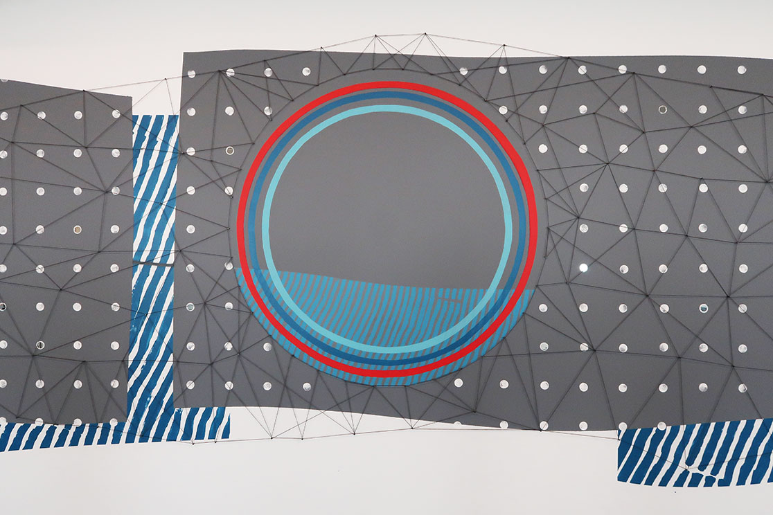
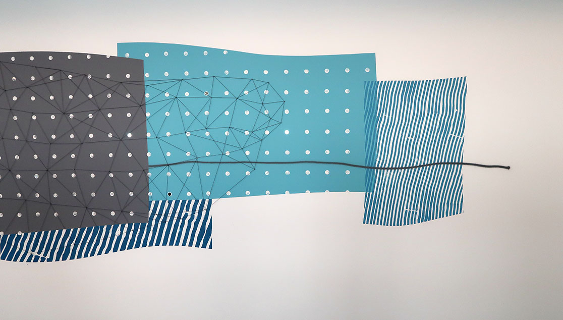
This first piece, inspired by the Santa Cruz Mountains, pulls from personal memories and natural references of that environment. Ocean waves, an evening night sky, mountains, and a camp fire set under a full moon all depicted in non-literal ways set within a larger sea of floating frames passing through like the oceans current.
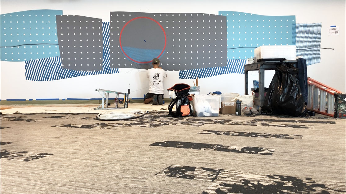
Mapping it out. Major help from Daniel Chen on this one.
.
Something I always enjoy doing is introducing new materials in new and reinvented ways to give the piece a three-dimensional effect and pushing a specific theme even further. I used a dyed hemp twine attached slightly off the wall with steel tacks to produce a wire frame birds-eye view of a mountain. Additionally, I attached tiny circle mirrors at random to the painted grid to mimic the stars in the sky. The repetitive slanted lines depict the currents of the nearby Pacific Ocean, while the rings in the center give a sense of balance to the airy piece while symbolizing the moons reflection and the energy of gathering around a camp fire during the last hours of light fall.
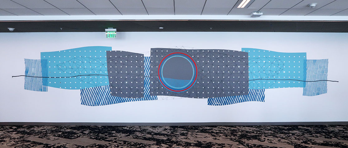
Landscapes (01)
synthetic polymer, wood, twine, nails, and mirrors
30 x 6 ft.
2018
My off-site work is often a collaboration of the many elements the artwork is interacting with — mainly the existing architecture, interior design plans, which way the wall faces, natural light, what the company is about, and the overall flow of the space. I’m always a fan of doing multiple pieces within a larger building as it allows me to think even bigger than just one moment. With the added room (in this case floor) between each piece you gain the advantage of making a visual connections between the separate works adding to the narrative and heightening the viewing experience.
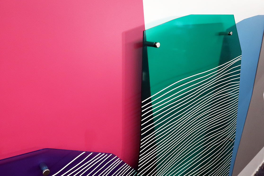
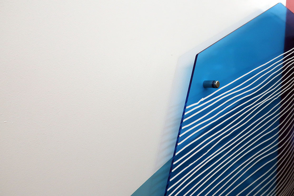
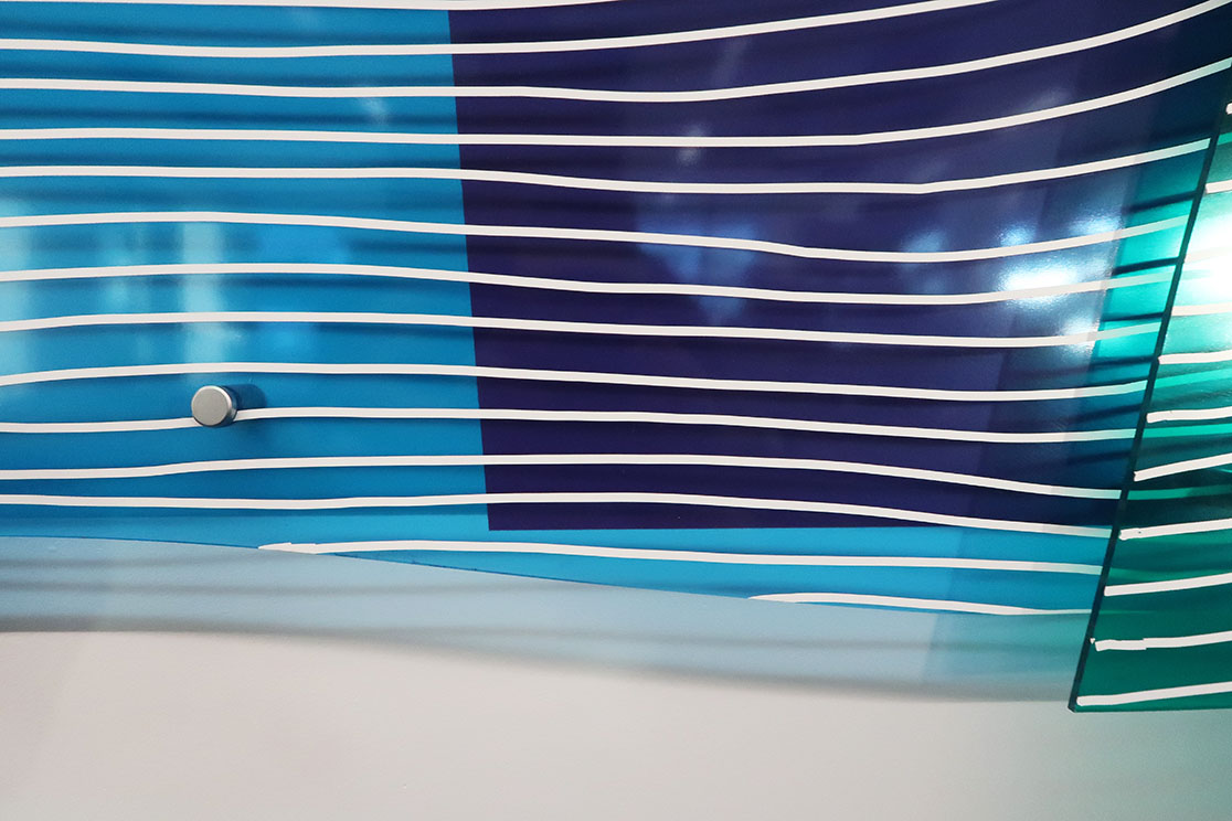
Continuing the theme of free form layering and methodical compositions, this second piece is inspired by the California Coast. Rock formations, the oceans edge, surface water reflections, and a classic California sunset combining bold color, transparent material and contrasting texture come to together in reinvented ways representing the exciting variety of views you see when traveling the coast.
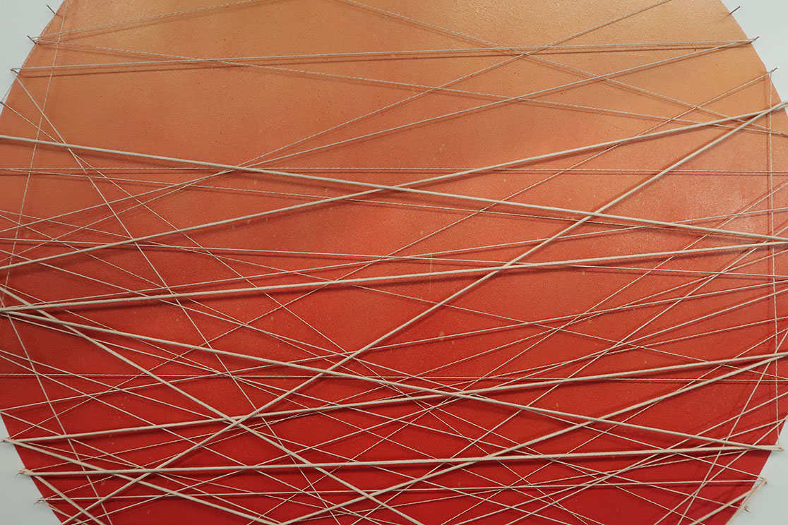
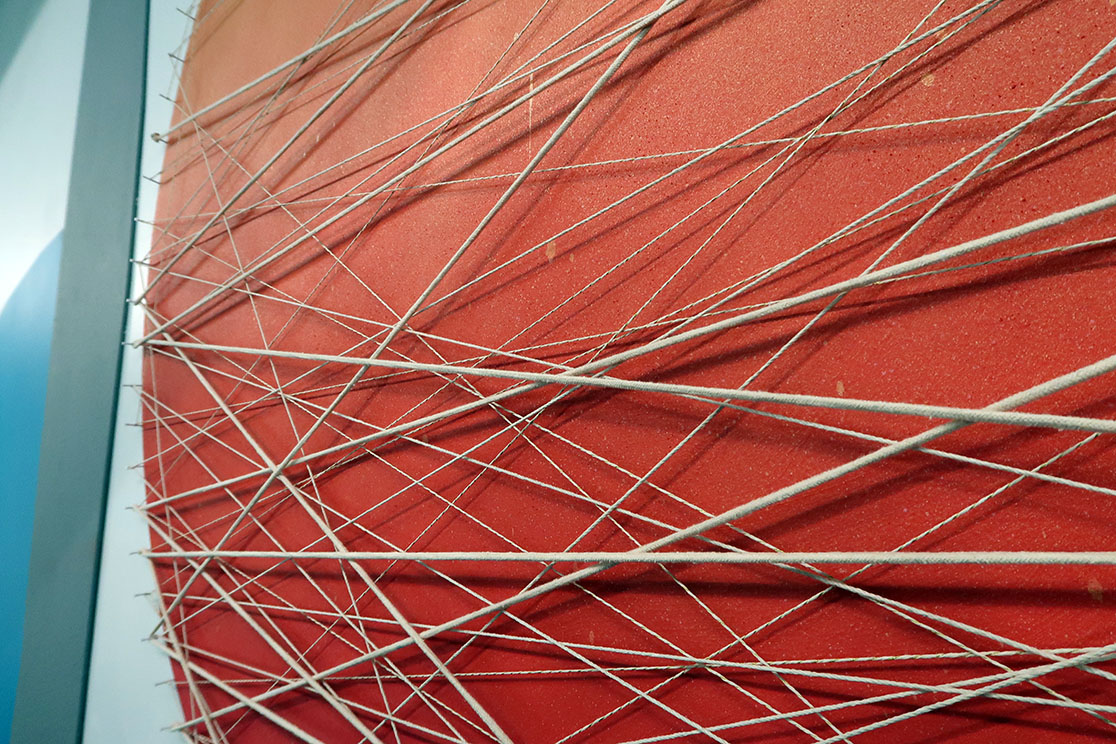
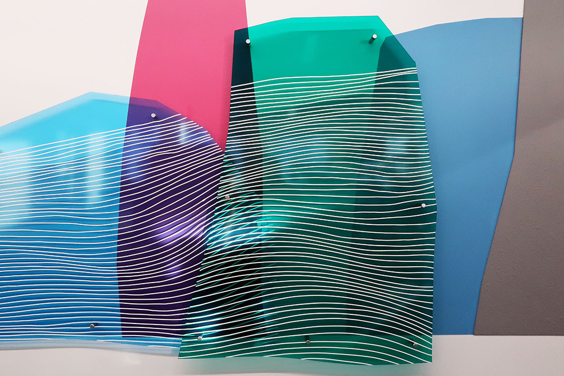
.
The added transparent plexiglass shapes made some surprising light reflections and shadows producing a multilayered piece that fluctuated depending on the amount of ambient and natural lighting. The overlapping colors bring forth all new colors while the contrasting surface treatments from the overall piece invite viewers to look closer.
As I continue to dedicate time to making these kind of works, my goal has and will always be to consider my role as an artist working in the often confined and rigid worlds of an office space. I think it’s absolutely important to highlight this kind of work in such environments as it shapes an all new experience. Moving things forward, my aim is to develop work that is clearly handmade that can’t be reproduced digitally while pushing the limits of a “mural” to provide moments of fearless imagination to spark creative thought.
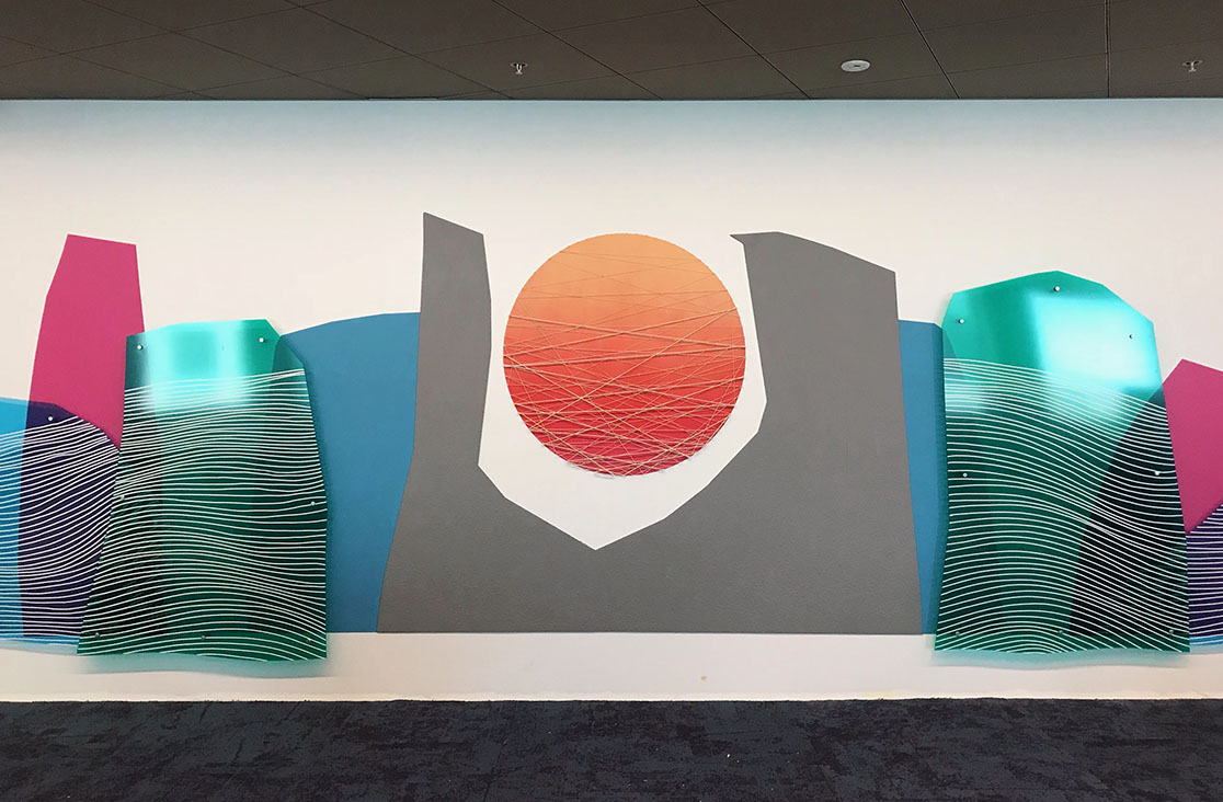
Landscapes (02)
synthetic polymer, aerosol, acrylic plexiglass, wood, twine, nails, and correctional tape
30 ft x 6 ft
2018
